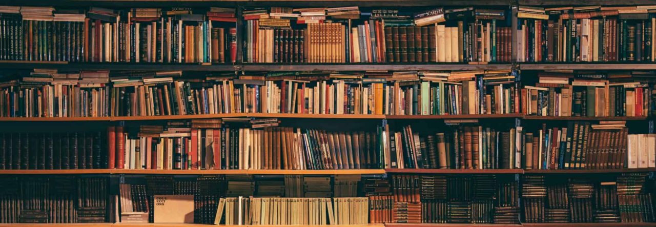
I think this is the actual final decision, barring some very minor font and color tweaks. I like how it looks on mobile, I like the big header image (I’m losing the rotation, but that’s okay,) I like the floating social media links on the left even if it doesn’t display icons for Goodreads and Patreon correctly, and I like the way the site title and sub-pages look.
There is still probably one more actual post coming tonight– I need to get moving on my end-of-year stuff– but I think I’m done with wholesale site changes for the time being.
Discover more from Welcome to infinitefreetime dot com
Subscribe to get the latest posts sent to your email.

I’m not a big fan of light text on darker background, but this looks good. 😀
I may still tweak the colors a bit. My Twitter widget is unreadable too.
How’s the font?
Very readable, great size! 😀
I like it! (Are you avaiable for hire? ahahahah!) Happy New Year…