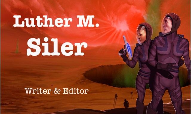
That email’s real and works and everything, by the way. And the font is American Typewriter, not Courier. It looks way different shut up. 

Discover more from Welcome to infinitefreetime dot com
Subscribe to get the latest posts sent to your email.

i didn’t mind the old font. yours OR mine, asshole. but this one looks nice, too. and i do think you’re solid with no tagline.
signed, rache: nonwriter & opinionated.
(see? unnecessary. you already have all the info you need, bahaa.)
LikeLike
Yeah, the tagline was mostly because I’d done ten thousand iterations of “Writer or author? Should I say publisher? Where do I put them? Should they all be in one line or stacked? What font should I use? How big should they be? ARRRRRRGH.” and mockery of the entire thing was the only way my brain could cope.
LikeLike
actually i think you should’ve put that entire stream of consciousness in there, ha.
LikeLiked by 1 person
DOES WORD THINGS FOR DOLLAR MONEYS
LikeLiked by 2 people
PERFECT
LikeLiked by 1 person
Is the ‘i’ supposed to be missing after the @?
LikeLike
Yes.
LikeLiked by 1 person
Fonts are marginally better. 🤔
LikeLike
More professional… but perhaps less inviting? You can’t win.
LikeLike
GODDAMMIT THAT’S THE FONT FROM THE OFFICE.
Back to the drawing board.
LikeLike
Welcome back from the technological rabbit hole. Email looks great.
LikeLike
I like the front and back. The Black and white is a good pairing to the color side.
LikeLike