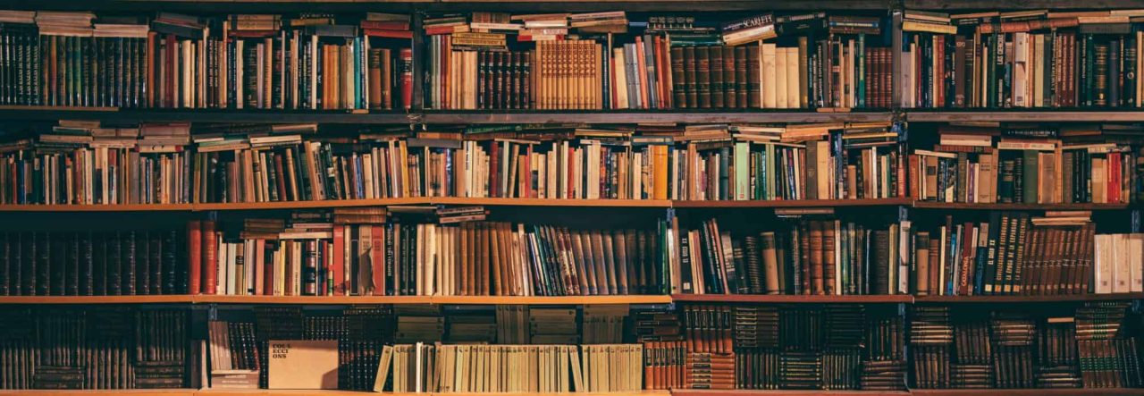
The book on the left is from the first mass printing of THE SANCTUM OF THE SPHERE. The one on the right is from the second, which arrived yesterday, twenty days before C2E2. You may need to click to get a better idea of the magnitude of the difference:
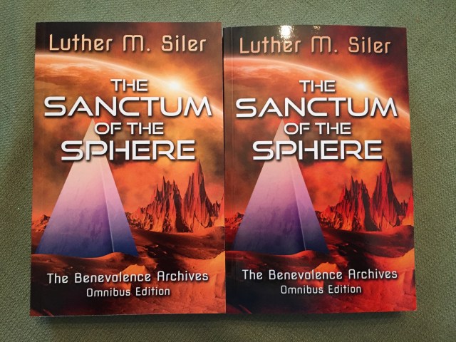
This is the original digital image that both files were printed from. NOTHING was changed in between printing one and printing two:
I already thought that the first printing was way too orange. The second printing is substantially oranger than the first.
Gripe at CreateSpace, knowing that I probably don’t have time to be certain that a replacement will show up before the convention? See if I can quietly find another printer before the next time I need to worry about this? Or suck it up and don’t worry about it?
For whatever it’s worth, my wife, who has seen the books in person, says that it doesn’t look that bad.
(ALSO: I’m not complaining at all about this part, but I find it entertaining: the entire order, a total of 126 books stretching across all four of my titles, arrived in the last three days. It is still listed as “in production” at CreateSpace. In other words, they haven’t even updated to say that it’s shipped, and it’s all here.)
Discover more from Welcome to infinitefreetime dot com
Subscribe to get the latest posts sent to your email.

I don’t mind the darker/orange-er cover. People at cons won’t know what the original image looks like, right? Plus, I think the more saturated cover makes the title stand out a bit more.
LikeLiked by 1 person
It actually looks pretty good in the picture, just… Really different. Actually I like the darker look of the image compared to the first printing.
Man, they are both really different than the source image though X_X.
LikeLiked by 1 person
The darker version stands out more, I like it…
LikeLiked by 1 person
The color saturation doesn’t look bad at all–but clearly they used two different printers. Also, the book on the right appears to be slightly shorter. Weird. But Hey, you’re in print! So sell them bad buddies at con!
LikeLiked by 1 person
Yep, it’s darker/more saturated. (The pyramid looks darker/more saturated, too, so the image isn’t simply more orange.) Looks fine, though. Not the sort of thing anyone would notice under normal circumstances.
LikeLiked by 1 person
What I am hearing is that I’m overruled. So be it. 🙂
LikeLiked by 1 person
It is darker and the original is the best, but it’s not a big deal. Every printing of my two POD books came up different shades, which is one reason I had a lithographic print run of my third book.
LikeLike
It’s YOUR book. You should have what you wanted. I would give them a call and tell them that you are not satisfied. You will end up keeping the ones they sent and they’ll send you a new batch with better color. It might still not be right but at least you can try. They are supposed to be printing it the way you tell them to! I would speak up.
LikeLike
The darker colour looks punchier, but what Corina said! … who knows, maybe they’ll give you a discount on the next batch!
LikeLike