A note on typography

This guy is running for school board:


You get it, right?  A+!  School board!  And the letter is in a bigger, different font and it’s red.

Unlike his road signs– picture to come later, if I can find one conveniently located to get a picture of– which are all the same color, and the font change either isn’t there or isn’t as noticeable, and therefore it takes me weeks to realize that you aren’t trying to signal your Jesusyness to people by sticking a cross into your road sign, which caused me to (ahem) cross you off my list of people to vote for.

Typography.  It’s important.

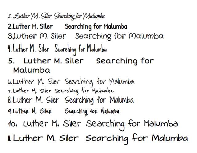
Font test 2

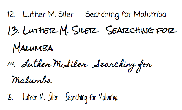
Nobody likes the font on the last image.  OK.  Any of these better?  And can you tell me what #4 is reminding me of?

fonts 2Screen Shot 2015-07-22 at 12.57.54 PM

Wednesday… word… and video… thing.

I’m not good with clever titles.  Sue me.

This song has been running through my head for three days:

And, because “This article on the typography in the ALIEN franchise is way cooler than it has any right to be, so you should read it” is too long for Twitter, have a link to an interesting article that I need to put somewhere.

That’s all for now.

Because God forbid I don’t double-post on Friday

20131108-184818.jpg
Take a look at the logo on that picture.

Just what the hell is going on there?

First, the weirdly-quasi-racist Yellow-Peril-with-a-mustache lookin’ laughing dude who replaces the letter “O.” I can deal with that.

For no clear reason, the second letter O is an eyeball. Which… okay.

But look at the I in “Joking.” Why the hell is that a little person? And somehow that’s the detail that pushes this logo from poorly-designed to truly inexplicable. Why the hell are any of these letters actually other things? Who the hell designed this? Who approved it? And why is the whole logo on what looks like a splash, and how long has this thing been in my gameroom and I’ve never noticed how goddamned weird it is, and holy hell is the yellow dude masturbating?

It may be time to call it a night already.