SEARCHING FOR MALUMBA cover redux and subtitle On September 5, 2015 By Luther M. SilerIn Writing Better? I hope? 
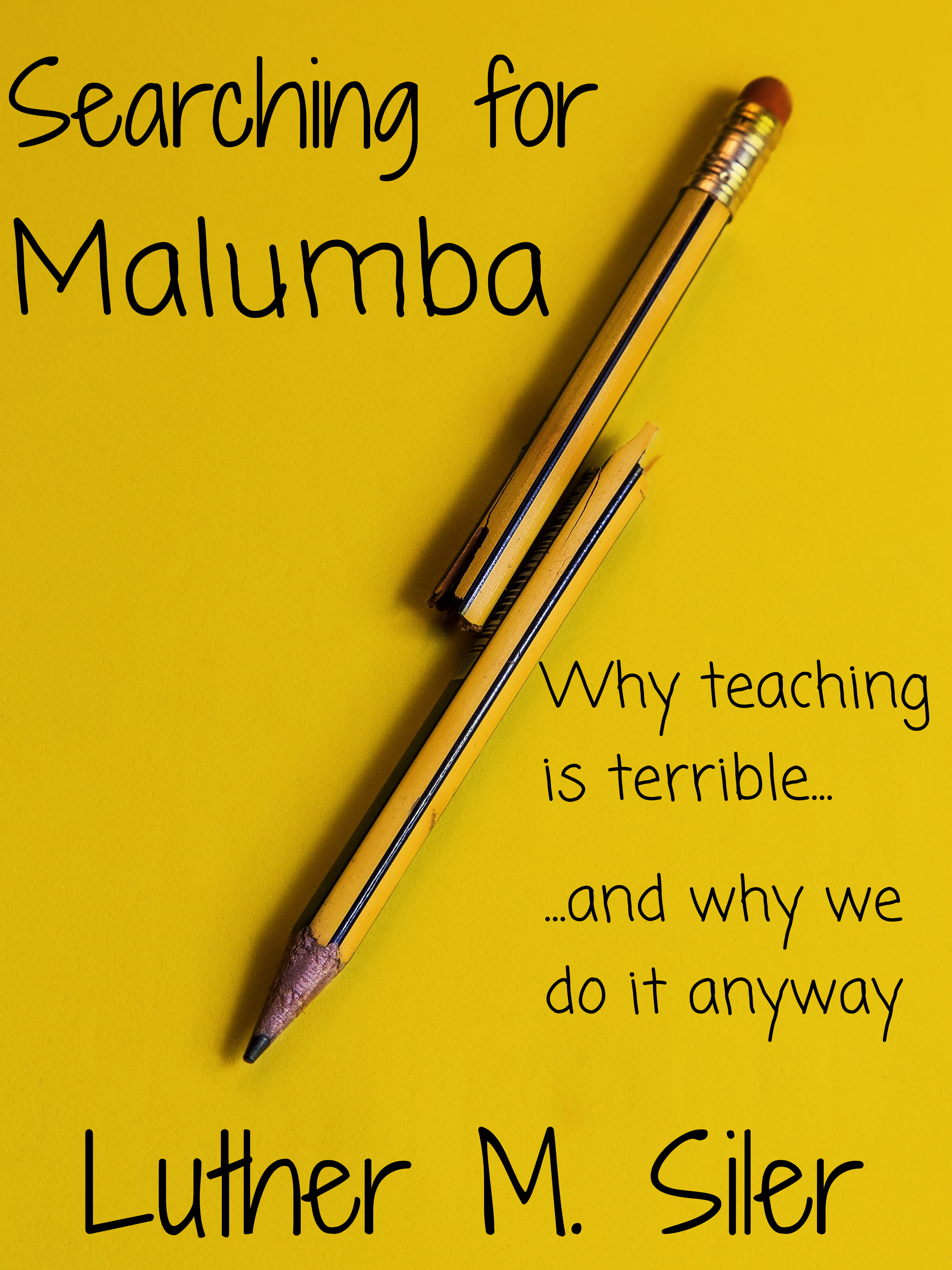
Discover more from Welcome to infinitefreetime dot com Subscribe to get the latest posts sent to your email. Type your email… Subscribe Share this: Click to share on Bluesky (Opens in new window) Bluesky Click to share on Facebook (Opens in new window) Facebook Click to share on Threads (Opens in new window) Threads Click to share on Mastodon (Opens in new window) Mastodon Click to share on X (Opens in new window) X Click to share on Reddit (Opens in new window) Reddit Click to share on Tumblr (Opens in new window) Tumblr Click to share on Pinterest (Opens in new window) Pinterest Click to share on LinkedIn (Opens in new window) LinkedIn Click to share on Pocket (Opens in new window) Pocket Click to share on Telegram (Opens in new window) Telegram Click to share on WhatsApp (Opens in new window) WhatsApp Click to share on Nextdoor (Opens in new window) Nextdoor Click to print (Opens in new window) Print Click to email a link to a friend (Opens in new window) Email Like Loading... Related
Isn’t your last name Silver? Maybe I’m misremembering. It looks good to me. LikeLike September 5, 2015 at 7:25 PM Reply
Haha, yea I figured. I probably just auto-completed it up until now in my brain. LikeLike September 5, 2015 at 7:29 PM Reply
Yes. I still think you need a proper font for your name. LikeLike September 5, 2015 at 10:15 PM Reply
Have you tried splitting the subtitle half left/half right of the pencil? (I have no idea if that will look any better.) LikeLike September 6, 2015 at 12:41 AM Reply
I like this very much… but I am not that wise about design. LikeLike September 6, 2015 at 6:08 AM Reply
Isn’t your last name Silver? Maybe I’m misremembering. It looks good to me.
LikeLike
I promise I got that right. 🙂
LikeLiked by 1 person
Haha, yea I figured. I probably just auto-completed it up until now in my brain.
LikeLike
Yes. I still think you need a proper font for your name.
LikeLike
Have you tried splitting the subtitle half left/half right of the pencil? (I have no idea if that will look any better.)
LikeLike
Yeah, we tried that. This looks better.
LikeLiked by 1 person
I like this very much… but I am not that wise about design.
LikeLike