These are both roughs; I think the image is happening but I’m not convinced about either the font or the text placement. Anybody have suggestions? (“Scrap the whole thing” is a fair suggestion, by the way.) You can click for a higher-res version but I think you get the idea.
Also, weird– the yellow on the right looks darker to me right now. It’s exactly the same. The only differences are caps vs. lower case.


Thanks!
EDIT: After reading the first couple of comments, let me take a second and explain my thinking here: this is my first (probably only) nonfiction book. It’s going to be about teaching, and it is mostly, but not exclusively, drawn from blog posts. About half of the material in it is on this very blog. I do not expect, even in comparison to my other books, that this one will sell very well, and I’m mostly doing it as a vanity project.
That said: I need something that screams “teaching!” when it’s the size of a couple of postage stamps on Amazon’s website, and thus the simple image of the broken pencil, which frankly fits my feeling about teaching right now anyway. The font choice is because I like the simplicity and the humility of it, although I think my second commenter is right that it does look a little low-rent and I may need to jazz it up a bit.
There will be a print and ebook edition; I have no illusions that anyone other than me will ever buy the print edition. I’ll print half a dozen of them to have some with me at cons and I suspect I won’t have to reorder that often. 🙂
Also, the image was purchased from SelfPubBookCovers.com, which means that I can’t just arbitrarily rotate the pencil or change the background color. Now, that doesn’t mean I don’t want to hear those types of suggestions– if the cover is bad, it’s bad, and I want to hear that– but understand that when you suggest that you’re saying “redo the entire cover,” not “alter this in Gimp.”
(All that said: my wife hates the cover, so if you feel the same, please don’t hesitate to tell me. If everyone thinks this is a misfire I’d rather know now.)


 I actually want to start by talking about this picture; I found it, as I often do before writing a post, by idly Googling a phrase from the post to see what pops up. At thumbnail size, I didn’t read “Skill” and “Whom,” I read “Kill” and “Maim,” which caused an immediate click, and now that I’ve seen the thing at full-size I’m just as confused as hell, because 1) weird and gross and 2) inaccurate in an oddly specific way, because I don’t know that I believe anyone who would put this together would ever use “whom” in the second column instead of “who.” We’re going for middle school verisimilitude here, yes? No middle schooler has ever said “whom,” ever.
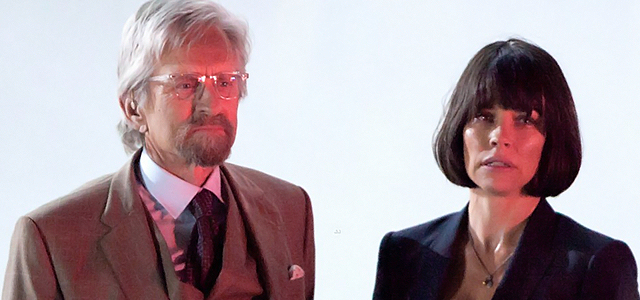
 tl;dr version: You should go see this, even (and perhaps especially) you were skeptical about the idea of Ant-Man getting a movie.