
I’ve been gaming, yes, but I’m keeping my eye on the prize this week.
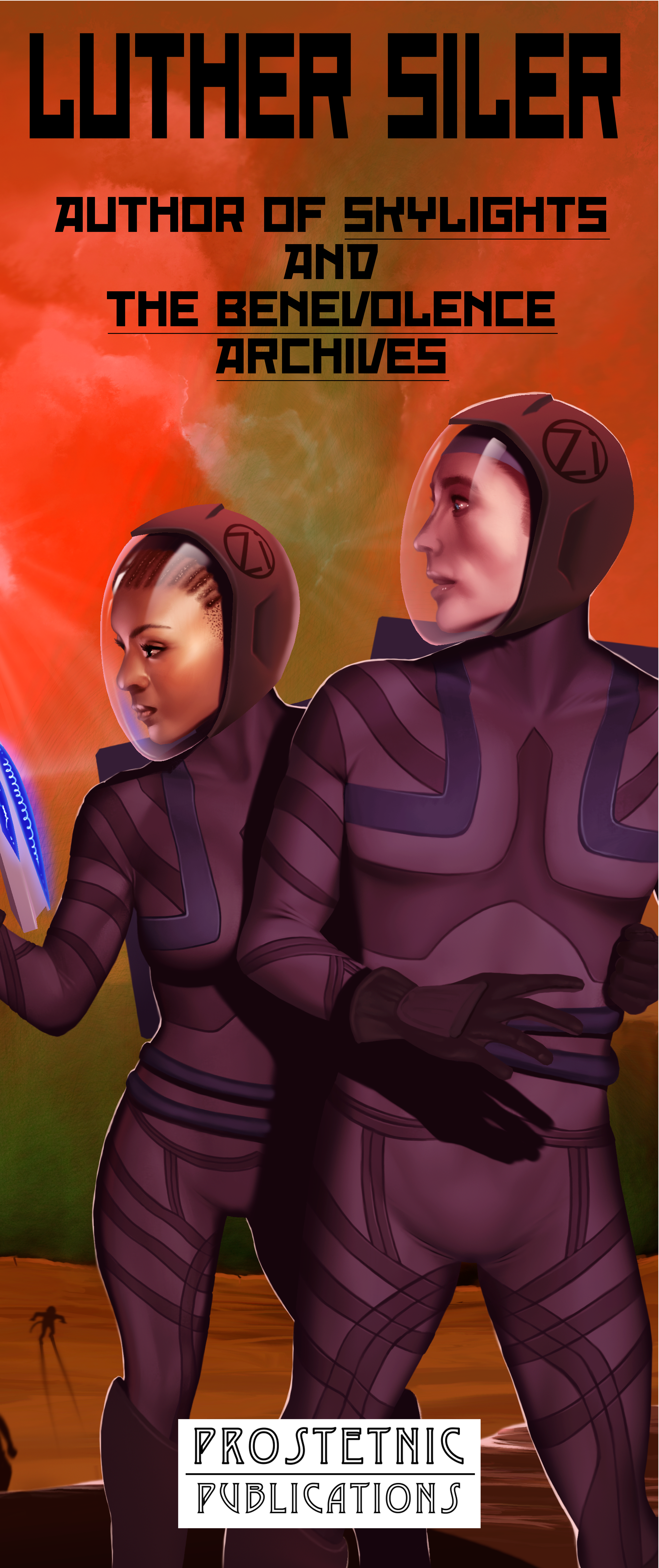
How’s this look? In the real world it will be six of your human feet tall.
Discover more from Welcome to infinitefreetime dot com
Subscribe to get the latest posts sent to your email.

It looks nice, but the tagline may be a bit hard to read, especially if this isn’t going to be on a flat surface (flag? vinyl print out?) With a glare from overhead lights, it might prove even harder. But I like the title and logo, and illustration. 🙂
LikeLike
At 100%, the letters are enormous– that’s 200-point text. I’m not terribly worried about legibility.
LikeLike
Then it’s good. 🙂
LikeLike
You can actually click through to see it at 100%. Just noticed that. 🙂
LikeLike
Yep. I was just thinking about it printed on a tactile surface, from a distance (I imagine it’s for your author table somewhere?), etc. No issue if you’re not worried about legibility and just want the illo to draw people in, which I’m sure it will.
LikeLike