
(Note: I typed this in the old editor, too.)
Dear WordPress:
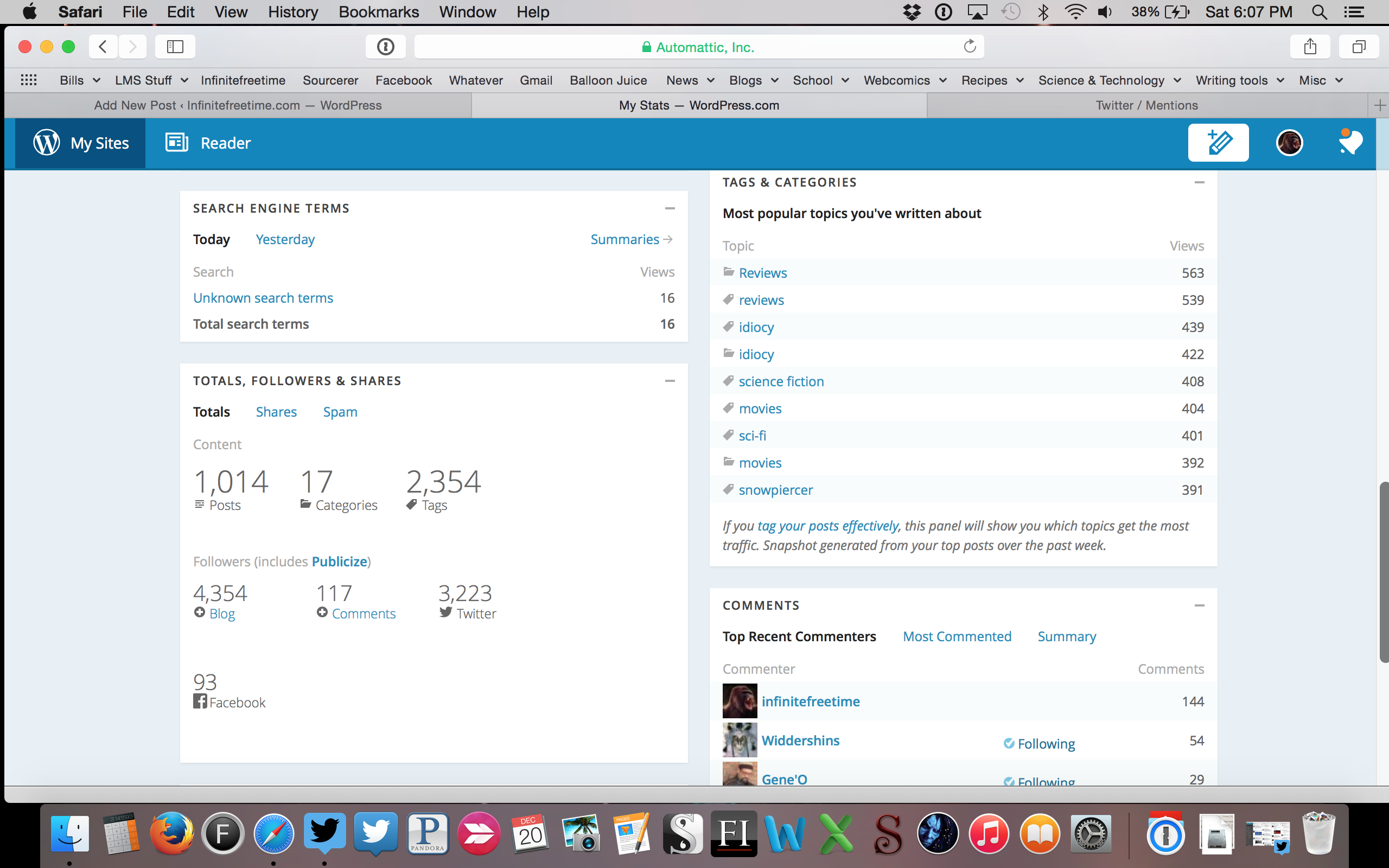
Let’s talk about your new stats screen for a bit. I put up a one-sentence post a few hours ago to confirm that other people feel the same way I do, and it’s amassed eighteen comments and twenty likes in that time, so I’m pretty sure I’m not on my own here. I’ve been actively blogging on your site for about a year and a half, although I’ve had the account for several years longer than that, and I spend a lot of time obsessing about my stats. An unhealthy amount of time, in fact.
You recently changed your stats page, and by a number of indications you seem to be interested in user feedback on it. However, using your feedback form really didn’t give me a chance to explain what I actually dislike about it. It could be that you’re not actually interested, but I’ll give you the benefit of the doubt.
Here’s the thing, guys: your new stats page sucks. It sucks a lot. And it doesn’t have to. Let’s talk details. Here’s what I see, on my laptop, when I open the old Stats page:
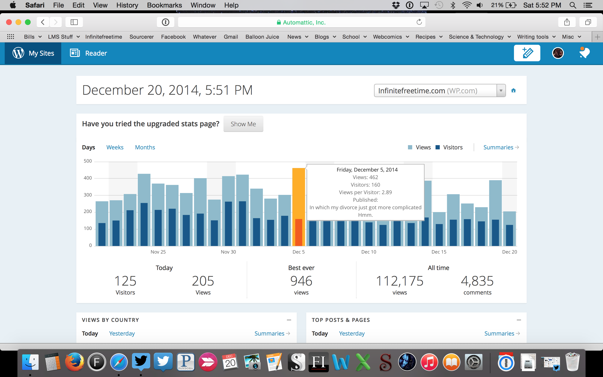
Now, notice a few things: first, daily viewers and page views for several weeks of blogging. Today’s numbers specifically, and some all-time and best numbers. I can get specific data about any day on the list simply with a mouseover. All this without clicking or scrolling. The stuff underneath is in two columns, so once I scroll down I’m going to see a lot more data.
Here’s what I see in your new, “upgraded” version:
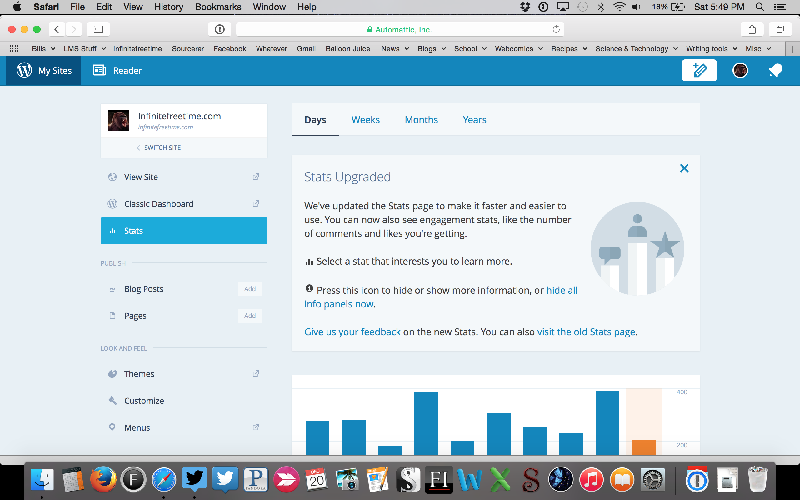
Nothing. Literally no useful data at all.
Okay, that’s not completely fair, because that big advert thing is there and I can get rid of it. Okay, let’s get rid of it:
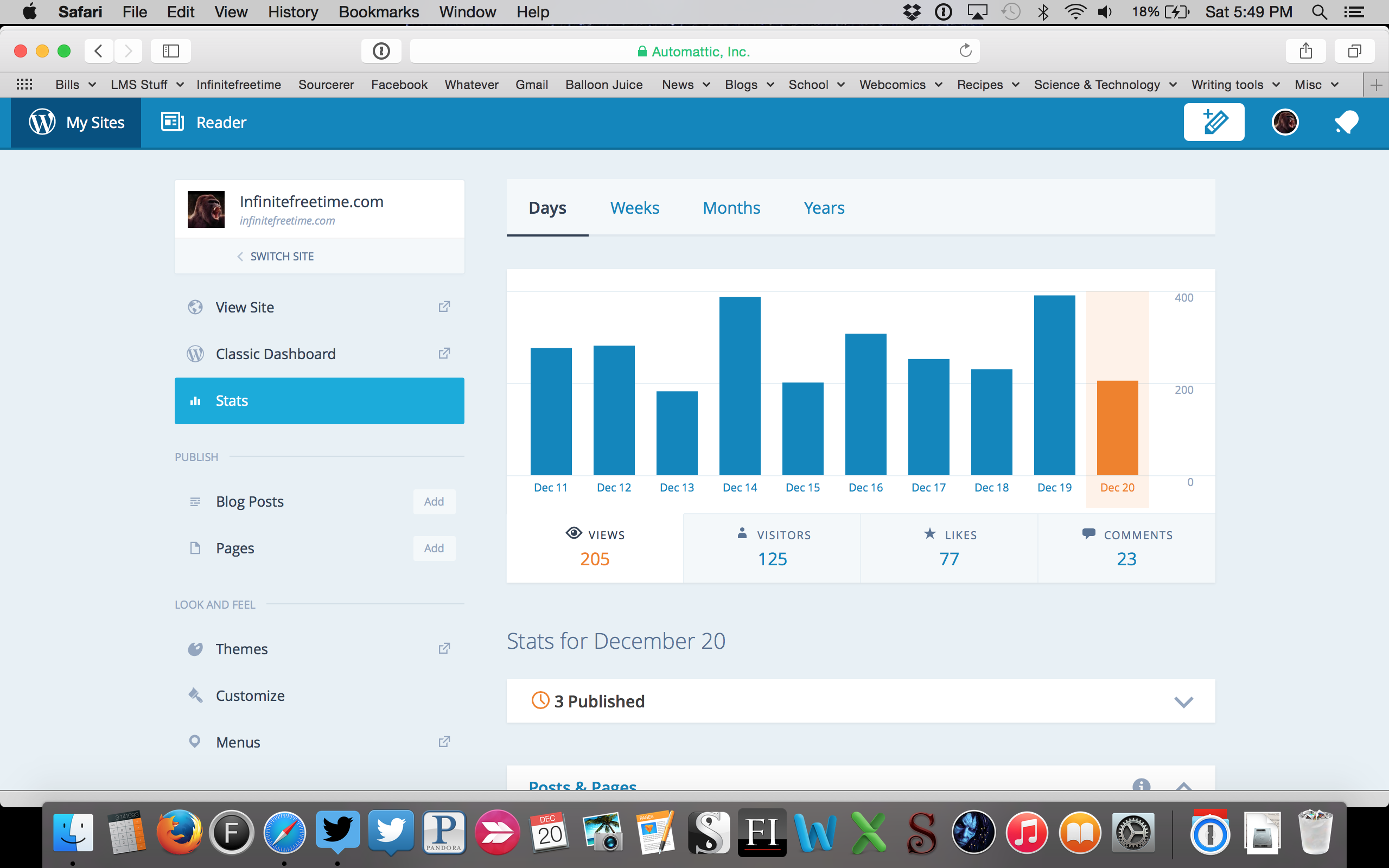
Right from the jump, guys, you cannot possibly believe this is an upgrade. Now, I actually do like that I can see Likes and Comments now. That’s a good thing! But that’s ten days of data, and there’s no way to make it show me more, and I can’t see views and visitors at the same time, the “Summary” view is entirely gone, and all my records are missing. There is now no way to get all-time data on my blog. There’s no way to get daily data that’s older than ten days. That’s not an improvement, and you’re lying if you pretend that it is.
Look at all the wasted space on this screen:
That. Is. Insane. No school of design anywhere authorizes this much wastage of my screen. Here’s the exact same data on the old version:
You cannot seriously suggest that the “upgraded” version is better. This is as close to objectively wrong a suggestion as I can imagine. It’s not better. It’s huge and wastes enormous amounts of space and makes me waste time with clicking and scrolling around the screen. And you’ve actually removed things like my search terms! (Granted: I shoulda opened up the “Yesterday” view on the search terms. It’s usually more useful than that.)
A moment of praise: I do appreciate seeing who my new followers are and when they subscribed, which is information that’s available but harder to find in the old version. But that doesn’t come close to overcoming this abomination:
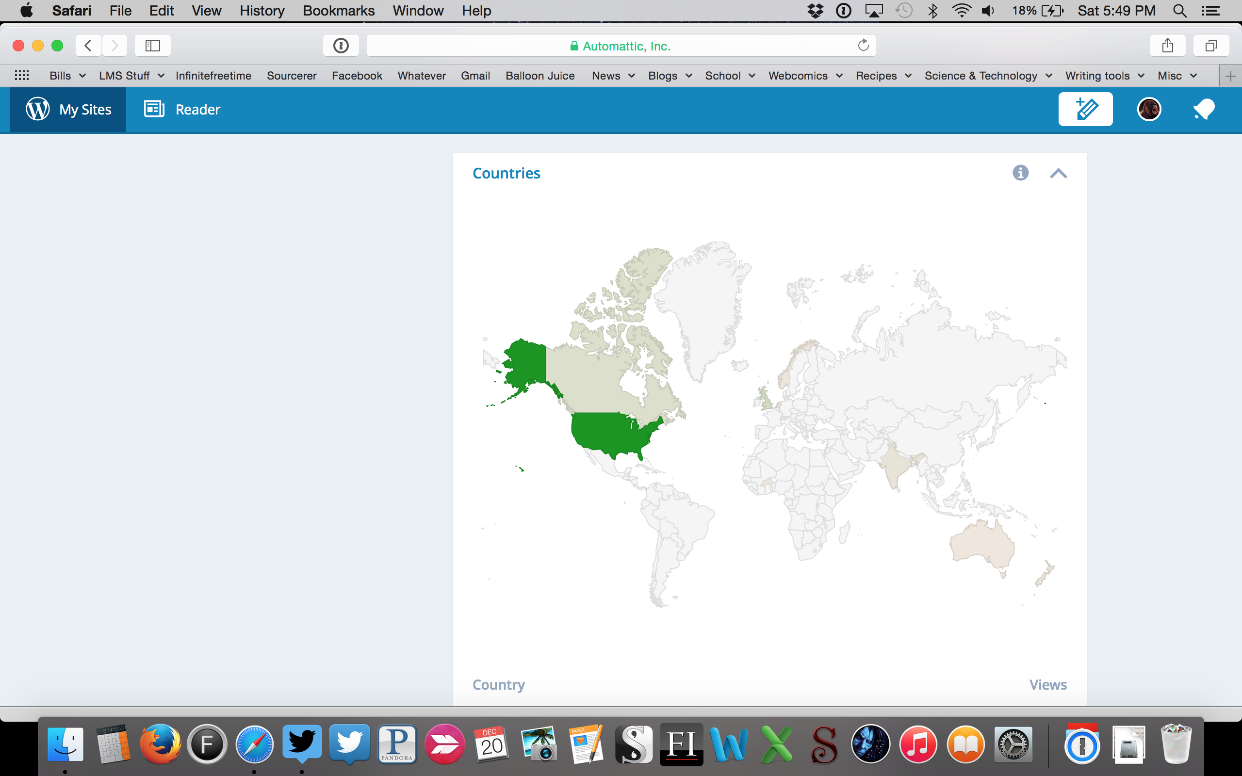
Who the hell decided making the countries view this much worse was a good idea, and why wasn’t that person immediately fired or demoted to emptying trash cans? In what world is that low-contrast nonsense better than this?:

You’ve made this worse. It’s beyond question. It’s indefensible. That light green nonsense is impossible to tell from the background, and anyone with eyes who looks at it knows it, which makes me think that you’re doing it on purpose. You’ve removed the countries information despite having plenty of room for it. There is no longer any way to get geographic data from more than a year ago. Do you guys have any idea how often I look at the “Since February 25, 2012” screen? Often enough that I didn’t have to look at that screenshot to remember the date. And in your “upgraded” version all that information is gone. I’m normally all about corporate conspiracy theories, guys, but “intentionally screwed their users’ ability to monitor their stats for absolutely no reason” is a really crappy-sounding conspiracy theory.
Keep the Likes and the Comments bar graphs. Keep the followers data. But fix the rest of this nonsense, and by “fix” I mean “go directly back to the way it was”. This is bush-league, crap design and you have to know it.
Discover more from Welcome to infinitefreetime dot com
Subscribe to get the latest posts sent to your email.

Reblogged this on Our Written Lives and commented:
Agree!
LikeLiked by 3 people
I know! Good grief! Also, I hope they’re still working on it, because the darn thing doesn’t even work half the time. My notifications just hang there, sometimes refuse to open at all, and seem to have a long delay.
LikeLiked by 4 people
I agree.
Reblog if you do.
LikeLiked by 2 people
The less you can see for free, the more incentive you have to pay for upgrades, is my thought.
LikeLiked by 1 person
The punchline here is I wouldn’t blink at giving them some money for a more robust stats package. They don’t need to gimp the old functions in order to do that. They’re not even offering it!
LikeLiked by 2 people
As discussed in the other post, I think there are useful things about the new Stats, but I think the user should have a choice which is the default. Like you I use the old editor, but they allowed me to make it my default. With the stats it is the new with a click to get to the old.
LikeLike
Nice summary. I also dislike the new editor, because I can’t find the writing helper to use an existing post as a template, which I do for all my Weekly Photo Challenge posts.
LikeLike
Agreed – the new design layout in general is pretty awful, and quite annoying to navigate to boot! I’m quite disappointed WordPress have done this as it actually encourages me to blog less because I can’t see the feedback/stat data. Makes it impersonal!
LikeLiked by 1 person
I don’t like the new stats page either 😦
LikeLiked by 1 person
I too agree/
LikeLike
Amen. I will continue to use the old dashboard, old editor, and old stats page as long as they’ll let me. The new changes are awful.
LikeLike
Reblogged this on Taylor Grace and commented:
Absolutely so true! Great post, Luther! Let’s hope WordPress listens!
LikeLike
Reblogged this on Sourcerer and commented:
Since Sunday is my preferred day for blogwanking, I’ll just share this today. Let me add. We publish stuff here and use the stats to measure the effect. Then we try and figure out ways to give our readers more of what we like. Reducing my ability to measure the effect makes WordPress less valuable. And I agree with Luther here.
LikeLiked by 1 person
Reblogged this on Okay, What if ? and commented:
What if we all spoke out? Will WordPress listen?
LikeLike
Nice analysis. I told WP editors how much I disliked the new stats page with a comment directly on the announcement they posted on their Ye-Here blog the day they debuted the “improved feature.” And every day it gets more likes. At least that I can still find in my notifications. The new stats page is a major fail, as you say. (Much like the “improved new post” template, which I never use.) No grid, no detailed daily breakdown that goes back far enough, no clue by WordPress editors that we use these numbers to figure out what we’re doing right and what we’re not doing so right. Which they should be back-checking more consistently, by the way. Thanks for this post today, infinite.
LikeLike
Thanks for writing this. You summed up everything I feel perfectly. You are right, the only good thing about the new view is the likes and comments data, but everything else is worse.
Improvements should make things better and easier not give us bunch of wasted space and make us click more for less info. Aye Dios Mio WordPress!
LikeLike
I agree… though there is one thing with the new stats page that I do like — I am able to see the stats for individual posts, which I hadn’t figured out if there was a way to do in the old stats. That is incredibly useful for me, but I am pretty much on-board with all your other issues with the new stats-“upgrade.”
LikeLike
Click on the little magnifying glass next to the post name in the old version.
LikeLiked by 1 person
Ah.. yeah.. thanks 🙂 Clearly I hadn’t spent a whole lot of time on the stats pages….
I feel like that particular view of information (in the new version) is more helpful for me — it’s the same information but it seems easier for me to read and understand at a glance.
LikeLike
To me it is pretty obvious what they are doing. They are going full responsive design for the Dash Board so they can deprecate any mobile app. Everything will be web based and designed for a Touch First experience. No one learns from Microsoft, they tried that too, didn’t work for them. From a back end and maintenance perspective though, it probably is a better format — but from a user perspective.. not so much.
(Although now that I have gotten used to the New Editor, I like it. But, still no Copy Post button [that I can tell] so it isn’t that useful to me.)
LikeLike
You’ve articulated what many thought. I also prefer the old stats page overall; I think it showed more data in less screen space. Thanks for the post, hopefully they’ll read and listen.
LikeLike
Reblogged this on Saving school math and commented:
I agree.
Reblog if you do.
LikeLike
Reblogged this on Sally Ember, Ed.D. and commented:
THANKS! You did a much better, more specific and screen-shot version of my very own rant. WP: TAKE NOTES!
LikeLike
Yup… Just like all other decent social media sites, it’s change for the sake of change. Corporate obviously asked for improvement, set the launch date, and handed it off to a bunch of balony eating interns who were too hungover to give it any real thought, and then whipped some bullshit together at the last second to bring to the meeting.
LikeLike
Thanks for saying what everyone else is thinking too. Reminds me of a song:
Don’t it always seem to go
That you don’t know what you’ve got ’til it’s gone
Pave paradise and put up a parkin’ lot…
LikeLike
Yep.. New stats page sucks. Don’t like it, and it is worthless.. even to guys like me who got nothing going on.
LikeLike
At least it allows to view either in days, weeks, months or years… but yeah it sucks… Anyway, we can still use the old one using the button at the very bottom… I also dislike their “upgraded” post/page editor…
LikeLike
Reblogged this on DragonflyLady's Writey Ramblings and commented:
Yes! This! WordPress, your new stats page SUCKS and I want no bar of it!! Gimme back the old one NAO!
LikeLike
I like the old one, as well, even though I often like change…
LikeLike
I filled out the feedback thing – told WP it was not better – useless in fact. I’m using the old page – Maybe if enough people complain the old page will remain an option. It doesn’t tell me what I really need to know ( which specific posts did the visitor from a specific country access?) I need to know what content is being read where – the old stat page is minimally useful, but way better than the totally useless new page.
http://artsyberger.wordpress.com
LikeLike
Concur!
LikeLike
Interesting. Day before yesterday when I checked my stats page, it was the hated new template. Today when I checked, it is back to the old page, with a button I’m invited to click if I’m interested in trying the new page, which I’m not and didn’t want when it was foisted on me before. It seems downright strange, but is it possible WP is actually listening to users?
LikeLike
I have filled out the survey multiple times telling them it sucks.
it also has some egregious UI bugs. The little info panels in each category, for example, if a stat is blank (say, you had no clicks) trying to get rid of the info panel with it’s “Helpful” hints on how to get something to appear, will actually close down the stat entirely.
For example, I click on a day I didn’t get any clicks, the Clicks stat will have the info panel on it. Clicking the (i) to close the waste of space will actually turn the chevron over. Now click on a day that does have clicks. Oops, your stat is still closed. Click the chevron to see your data. oh, the info is back again, click the (i) to close it and just show your data. Okay, click on the clickless day again. Oh the panel is back again. And btw, clicking on hide all info panels will not hide them on blank stats either.
LikeLike
Reblogged this on Opher's World.
LikeLike
Reblogged this on Logic is my Virgin Sacrifice to Reality and commented:
Dear WordPress:
As someone who earns a living working on BI/Analytics, transforming raw data into meaningful insights, your new stats page is a joke. This new stats dashboard displays less data in a less user-intuitive manner than your old site. It is not an upgrade. It is an embarrassment.
It appears that you’re aiming for a mobile-friendly aesthetic, which is a reasonable goal. Unfortunately your stats dashboard removed customization in exchange for a cripplingly limited view of data on my computer, with acres of white space preserved for future generations on the left half of my screen. On my tablet I see your app is using a stats dashboard very much like the old stats dashboard… making me wonder why the hell you brutalized your site but maintained a greater level of sanity in app design.
This is not to say that the old dashboard is perfect, nor do I mean to take away from the great new data points rolled out in your new stats page. (Wherever those are, keep scrolling, you’ll find them eventually.) What I mean to say is that the data presented is fantastic but that the design is an abhorrent travesty. The ideal is more datapoints compressed into what’s referred to as a “dashboard,” not more datapoints dumped into some endless-scroll abomination.
Please fire whomever is responsible posthaste, because I believe they may have misinformed you regarding some important design choices, and I fear what other suggestions they may have. (Any good things they had to say about treegraphs are wrong. That one’s a freebie.)
Thanks!
LikeLiked by 1 person