Do any of you know how to change this image? Is it through my hosting site, maybe, because I can’t figure out how to change it on WordPress? It’s the default image on the card whenever I link a post that doesn’t have an image on it, and I have no idea what to do to change it.
For some reason, I’ve been thinking about cars a lot lately. I am, to be clear, perfectly happy with my stupid little Alien Green Kia Soul– it is a comfortable drive and the car is reliable and gets me where I want to go. I’ve had to replace the tires and the battery since buying it, as well as some brake work if I remember correctly, but nothing that doesn’t fall squarely under routine and expected maintenance, although I suppose I wouldn’t have minded a little bit of warning that the battery was about to shit out on me.
The plan has always been to hold on to this car until my son is old enough to drive and then to give it to him. He’s 12, so that’s still four years off, and I feel confident that the car still has a good 8 to 10 years left in it at least, assuming that everything doesn’t suddenly fall apart at once. So I am not in any meaningful way in the market for a new car right now, and that’s not going to change, absent some sort of disaster that requires me to get a new car.
Anyway, point is, at the moment all of this is purely theoretical. However, I find, the more that I think about it, that I really want my next car to be a Nice Car. And in looking around and trying to decide on what I mean by “Nice Car,” I’m discovering that most of what I find myself idly looking at ends up around the $45-55K range.
My current car cost me $16000 and is the most expensive vehicle I’ve ever owned. So this would represent a bit of an upgrade. I’m literally considering going from a Kia to a Lexus or a Mercedes.
Will I be able to afford it? Maybe. It’s gonna depend on how good I can be with my money once I murder all of my non-mortgage debt during this school year, which– again, knock on wood, absent any disasters– feels pretty thoroughly doable, especially now that I’m getting paid for this overload.
(My first post-overload check is tomorrow. Am I excited? Hell yes.)
So, he said, having taken six paragraphs to get to the fucking point, I’ve been thinking about cars a lot, and I’ve been paying closer attention to the cars I’ve been driving past while I’ve been on the road, and just kind of noticing what I notice, if that makes any sense and I hope it does.
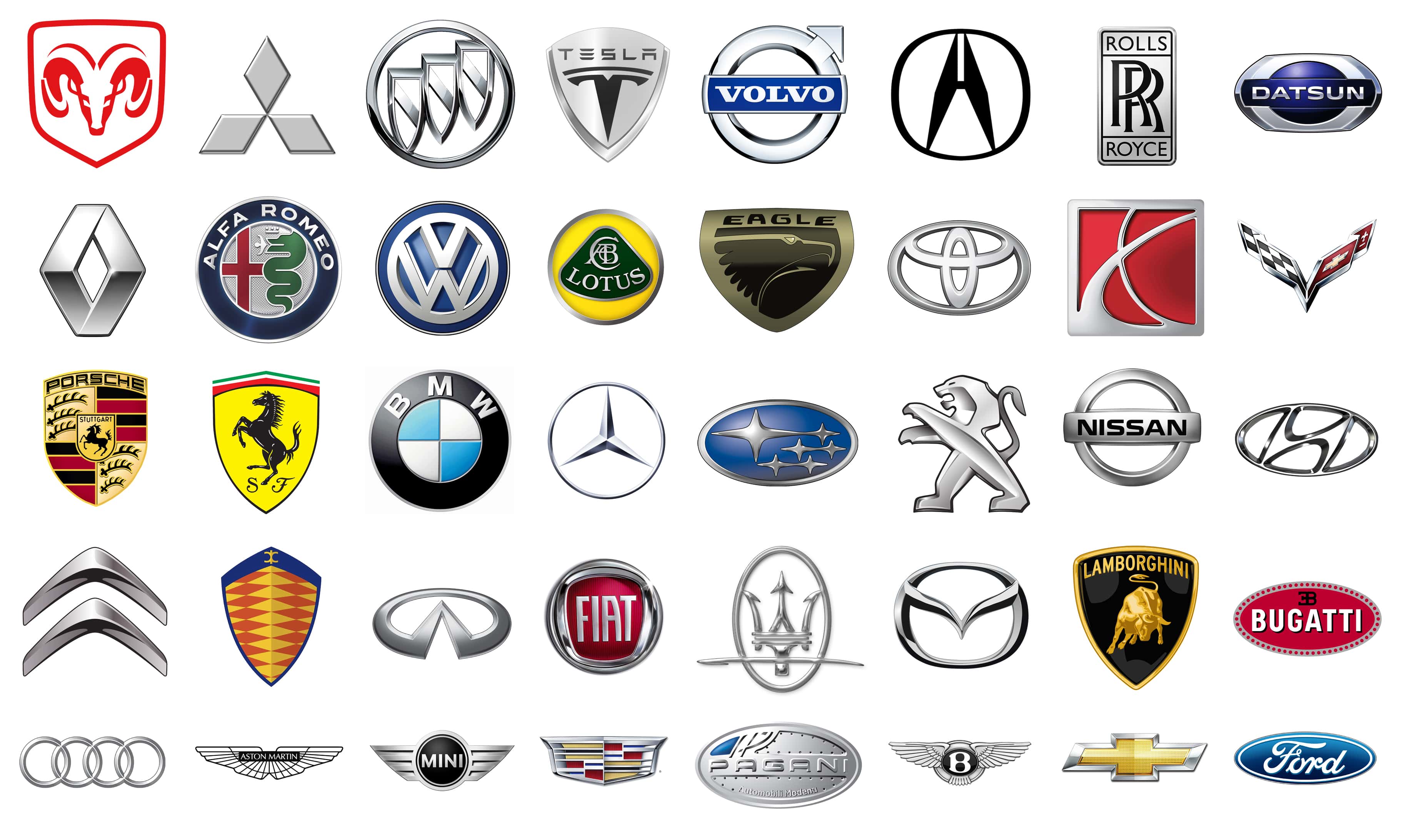
And in the process I’ve been wondering about car logos. How many of these do you recognize?
Some of them have words in them, of course– you’re not going to screw up Ford or Volvo’s logos, and some of them have pretty clear letters in them, although the H in the Hyundai logo is pretty stylized, and the L in Lexus’ logo in the featured photo could probably be mistaken for an ordinary acute angle. But at least half of those don’t have any clear connection to the name of the company they represent.
The point: Why do car companies use logos like this, and — to my knowledge at least, and I’m willing to be proven wrong — no other category of corporation that I can think of? I mean:
With only a very few exceptions– Windows and Shell, and Shell’s icon is a shell— there’s damn near nothing on there that doesn’t have at least some text in it. Computer companies, maybe might be more likely to use abstract logos, but not as rigorously as car companies do. So what’s the deal here? Why are car companies, specifically, so likely to use such abstract logos? I mean, every company has a story behind their logo, and I admit I didn’t notice the T in the Toyota logo until reading about it today, but I can’t find any reason why cars and more or less only cars tend to use wizard sigils instead of readable logos like a sensible company.
I need a historian of marketing. Help me out here.
I have sung the praises of Potawatomi Zoo more than once in this space; our local zoo is genuinely a highlight of northern Indiana and we’ve been members for quite some time. They’ve recently acquired four new giraffes and have spent a lot of money extensively renovating a large swath of the zoo to construct a proper habitat for them. The zoo is typically closed during the winter, but once a month or so they have Zoo Days anyway, where they open for a few hours, rain or shine, and well, you see whatever you might be able to see. However, today was the first day that seeing the giraffes was possible, and the high today was a rather unseasonable 68 degrees.
We were going to the zoo.
Unfortunately, so was everyone else in South Bend. When we got to the zoo the line to get in was a block long, and the parking lot is a mess under the absolute best of circumstances, and “perfect Spring day featuring the public’s first real chance to see four hotly-anticipated new animals” is, uh, not the best of circumstances. So we did not go to the zoo today. And as soon as we decided we weren’t waiting in the line, much less whatever horror we might have encountered inside the zoo (they were limiting access to the animals, letting in a limited number of people for 10-minute blocks, so who knows how many a “limited number” is) we immediately drove past two perfect parking spaces.
We came home, opened all the windows, and I put shorts on.
There is a 60% chance of snow on Monday. Because Indiana.
If you want to feel like a celebrity for a little while, post the words “looking for an artist” on Twitter. Because holy shit are there a lot of people out there who very clearly have programmed a bot to reply instantly to any use of that sequence of words. And the funny thing is that I can tell from referrals how many people clicked back to the article, where I clearly describe what I’m looking for, and the vast majority of the 43 people who responded to that tweet or however many more who immediately DMed me did not (possibly because they were not human) click through the link on the Tweet to see what I was looking for.
Hilariously, however, I got a recommendation in comments almost immediately, and while I haven’t contacted the artist yet her style is exactly what I had in mind, so I think I’ve got somebody. I’ll take some time tomorrow or later today to go through all the comments I got and then delete the original Tweet just to do my diligence, but … man, asking the Internet for something worked this time.
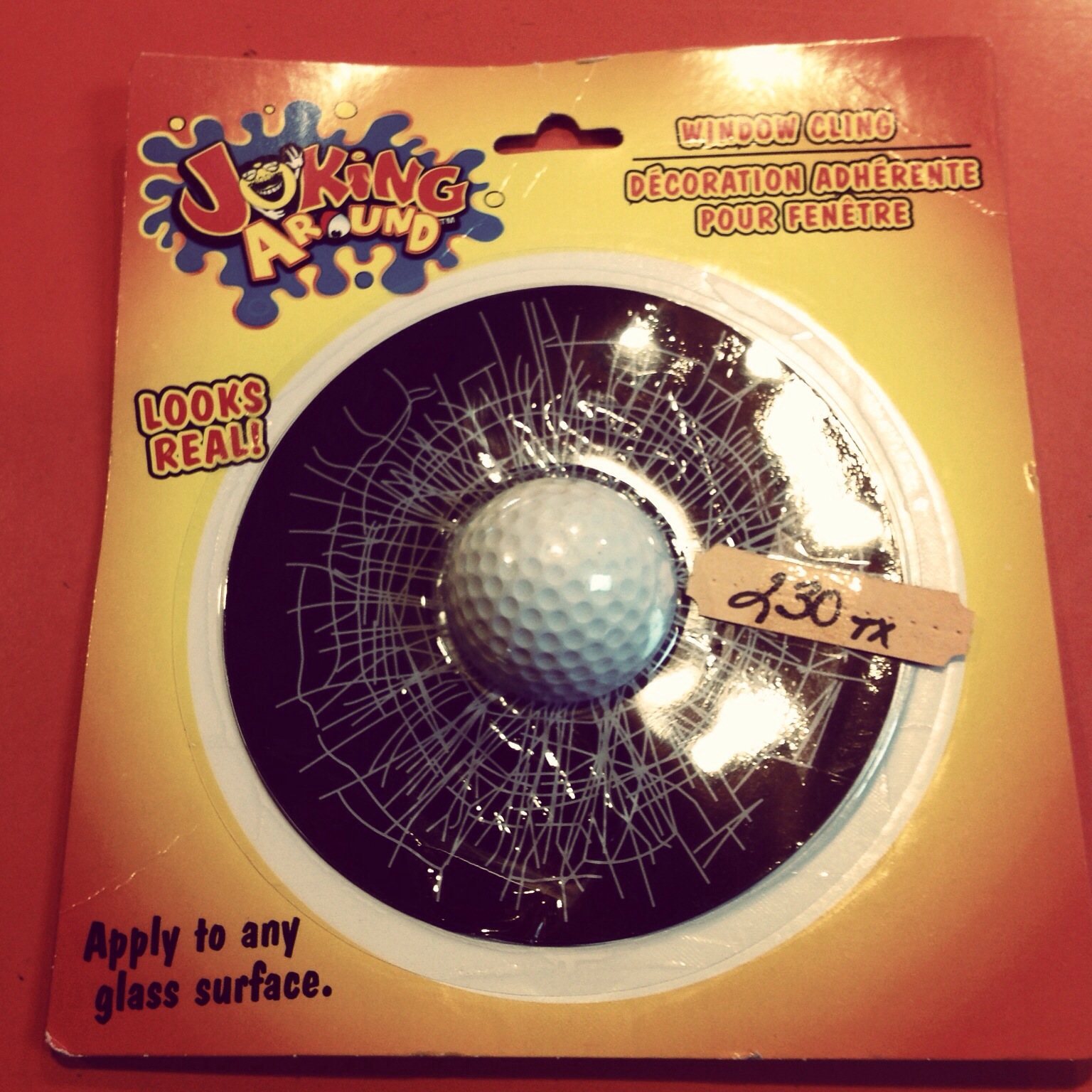
The book doesn’t have a real title or a cover and only has like 1400 words right now but hell let’s spend an hour fiddling around with title logos just because. Why not, right?
First, the weirdly-quasi-racist Yellow-Peril-with-a-mustache lookin’ laughing dude who replaces the letter “O.” I can deal with that.
For no clear reason, the second letter O is an eyeball. Which… okay.
But look at the I in “Joking.” Why the hell is that a little person? And somehow that’s the detail that pushes this logo from poorly-designed to truly inexplicable. Why the hell are any of these letters actually other things? Who the hell designed this? Who approved it? And why is the whole logo on what looks like a splash, and how long has this thing been in my gameroom and I’ve never noticed how goddamned weird it is, and holy hell is the yellow dude masturbating?