(Shut up: Gimp is the name of the software program I’m using.)
This is a business card. Right? Sure it is:
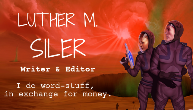
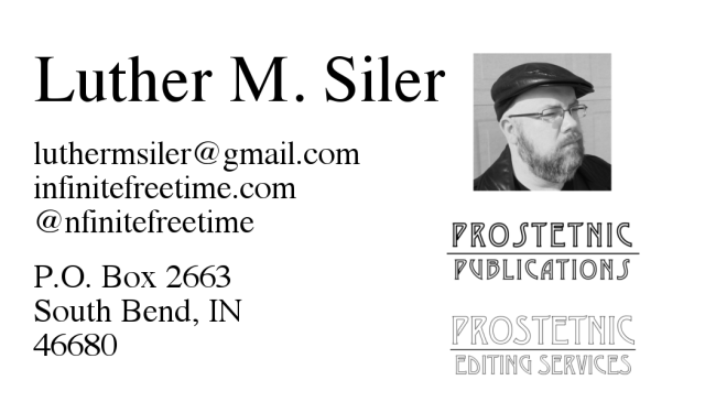
Color is the front, B&W is the back. I’m still doing the bookmarks but I need something business card sized I can hand out for other reasons.
Thoughts? How much do these suck? And I’m still fiddling with the tagline. And the fonts. Everyone always hates my font choices.
Gah.

I know you’re trying to be witty with the “word stuff” but I think it’s going to have a negative reaction. I saw it and immediately had a negative impulse, but having a half-point uptick in positive.
Your statement has to be about the person reading it, not about you being clever. “Bringing words to life” for example is great because it is what you do as a writer, and what you would do as an editor.
LikeLiked by 1 person
It doesn’t help that the line itself isn’t very good. I’d just done 40 versions of “Author/Editor/Publisher” that didn’t fit the space well and needed something different. That won’t be the final tagline.
LikeLiked by 1 person
Only put publisher if you are open to publishing other peopel’s stuff.
LikeLike
The font is a little bit comic-sans. Agree with previous comment about the language.
LikeLike
HEY.
That’s mean.
LikeLike
Why not attach your domain to gmail? I hate free email addresses on business cards. Takes the professionalism down a notch. It’s only $5 a month IIRC.
LikeLike
I actually wasn’t aware that was a thing.
LikeLike
Be aware that at some point I’m going to have to hunt you down and fight you because of the vile technological rabbit hole this has led me down. I still love you and all, but we gon’ scrap.
LikeLike
my main concern here is that i changed the font on my blog BECAUSE YOU WANTED ME TO and now you’re telling the world you’re bad with fonts. #hate
if i have a secondary concern, it would be why you need a tagline at all; ‘writer and editor’ ought to be enough information for anyone who… you know, is literate at all, i would think.
LikeLike
Your previous font was completely unreadable. I can handle “this cannot be read by humans with eyes.” Also, I literally just like twenty seconds ago put up a newer version. See if that’s better.
LikeLike
I like the colour cover, with the clear writing and message. I can see the problem with word-stuff, but if you replace it you want something equally warm and informal. I was somehow less satisfied with the fonts on the info side… but I am the last person to advise on fonts.
LikeLike
Back is very cool.
Front: image – cool. Tagline – extra cool. Fonts – too many. Pick one, maybe two.
😀
LikeLike
I actually liked ‘word-stuff’, I suppose it depends who you’re aiming at.
Anyway. First impression was “The gap between Luther M. and Siler is too big”.
I’m not so good at fonts either, so I won’t judge your choices. I would tend to agree with one of the previous comments though – fewer are better than more…
LikeLike
Also, how were you patient enough to learn to use Gimp?? I have tried and given up more times than I want to admit…
LikeLike
Oh, make no mistake– any attempt at doing stuff with the program is still involving a lot of cussing. That said, I’m starting to get decent at using it for the stuff I need to use it for. Ask me for something more complicated than a bookmark or a book cover and I’m gonna be right back in the shit again.
LikeLike
I like the color and the people used…but yeah, fonts are tricky. I have no suggestions though for the same reason. I hate fonts sometimes.
LikeLike