…because Adam Dreece got me thinking about how to be more effective (while, simultaneously, less or at least equally annoying) on Twitter. And these get MUCH more interaction than plain Tweets do:
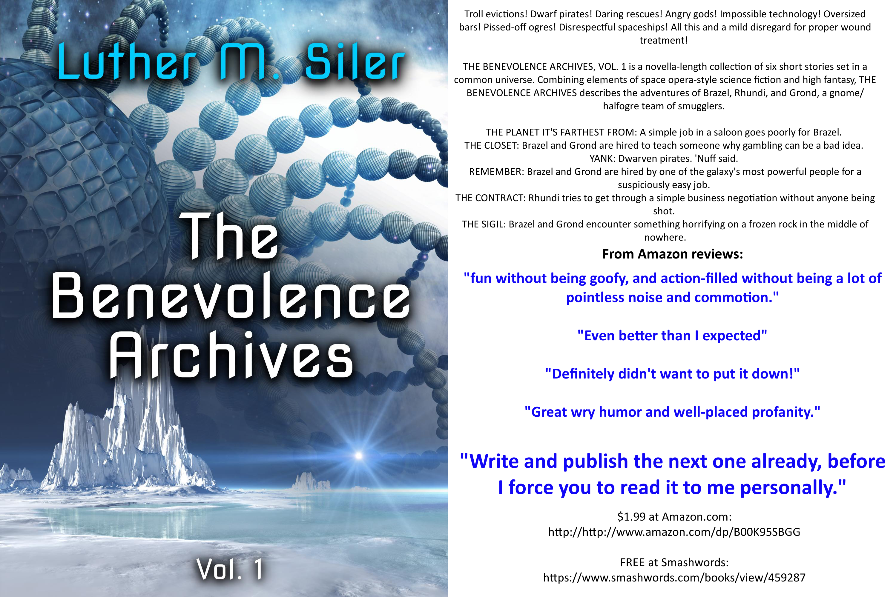
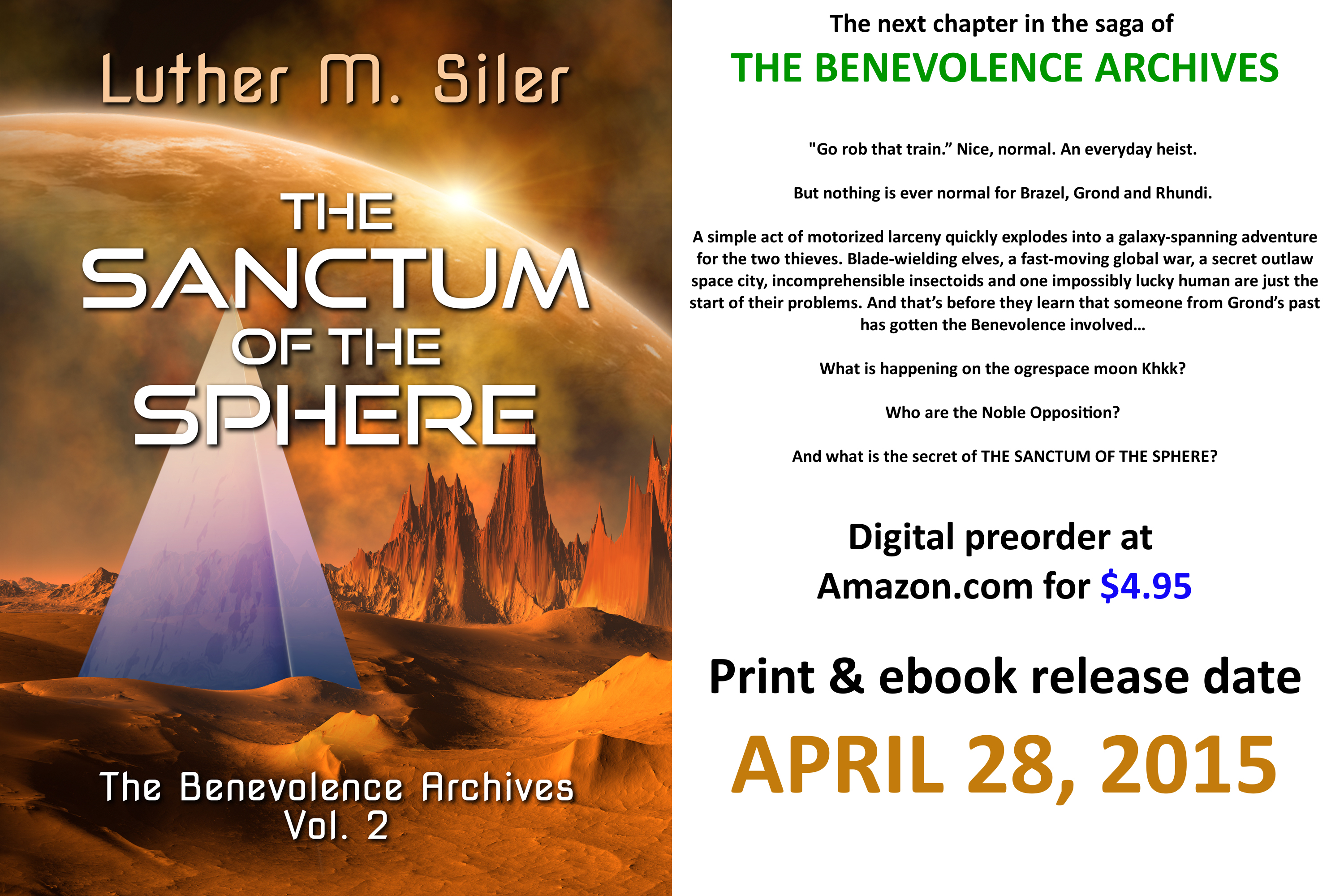

Not perfect, any of them– I can tell I’m a nub at this image-creation game– but effectiveness is improving. Woo!

I like them. I think I need to make a few, too. Ordinary tweets with a link and hashtags are not working so well. BTW, I’m 60% through Skylights. I already know I’m going to want the next book.
LikeLike
I hope so. 🙂 I’m always nervous with that one that people will hate the ending.
LikeLike
I’m not to it yet. Hush! 😉
LikeLike
Custard EVERYWHERE.
LikeLike
Coolness! I ❤ GIMP and prefer it to PhotoShop that we use at school. Next, you might want to work on learning Inkscape. It is free and open source like GIMP but is completely vector based like Illustrator so it is much easier to work with when it comes to dealing with text like on your images here.
LikeLike
I’ll look into it– GIMP is a pain to use with text, and I’d like a few more options than what it gives me, or at least more easy-to-realize-they’re-there options.
LikeLiked by 1 person
I agree. In Inkscape the text stays vector and scalable until you are ready to export it so you can get the sizing perfect with no pixelization or fuzzy edges.
LikeLike
This is a good place to start: Kerning, Spacing, and Other Text Tricks in Inkscape
LikeLike
I have no idea why this got caught in moderation, and my apologies for taking so long to notice it. I’ll check the link out– thanks. 🙂
LikeLike
Grrr, I tried GIMP a year ago. I made some passable images, but was maddened by the lack of some basic features (probably my ignorance), so it sits on my desktop sneering at me. I’m still saving for Photoshop.
LikeLike
Check your inbox…unsolicited opinion awaits you there along with some prezzies!
LikeLike